Submitted by Thad Beversdorf via FirstRebuttal.com,
So I’m currently teaching applied financial modeling at Marquette University in the beautiful blue collar town of Milwaukee, WI; home of the Harley, the (Miller) High-Life and SummerFest. It’s a great town and a great school. A few years ago the business college brought in a pretty savvy guy called David Krause who then started a program called AIM, where the top finance students actually manage more than $2M. Because of the program’s success US News & World Report ranked Marquette’s finance program 21st in the nation this year. Not bad for a small Jesuit school in the midwest.
Now I mention this because after 15 years in banking, teaching financial modeling has forced me to reacquaint myself with some of the basic tenets of markets and valuation. Such things tend to get lost in the midst of «getting the deal done» and chasing paper profits. This reacquaintance process has been quite illuminating for me and I thought perhaps for others too.
A reminder of what the market actually represents is a good place to start. The stock market is simply an asset with some intrinsic value based on an expectation of future free cash flows to equity holders. Those cash flows are generated from revenues less costs of the underlying companies that make up the market. Let’s use the Wilshire 5000 Full Price Cap Index as the proxy market for this discussion as it is the broadest measure of total market cap for US corporations. It’s level actually represents market capital in billions.
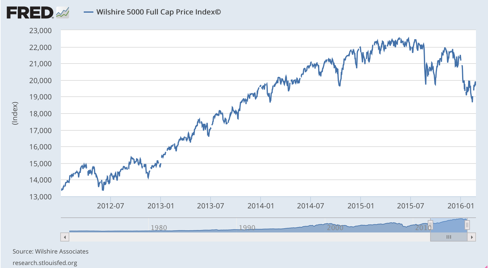
So the market has put a valuation on those expected future cash flows to equity holders (as of today) at around $19.7T (a 55% increase from Jan of 2012) down from around $22.5T (a 77% increase from Jan of 2012) at the market peak last summer. So let’s take a look at the growth in cash flows of US corporations over that same period.
We should expect to find a growth pattern in free cash flows similar to the above growth pattern in the overall market valuation (the Wilshire is a statistically large enough sample to be representative of total US corporations). Let’s have a look…
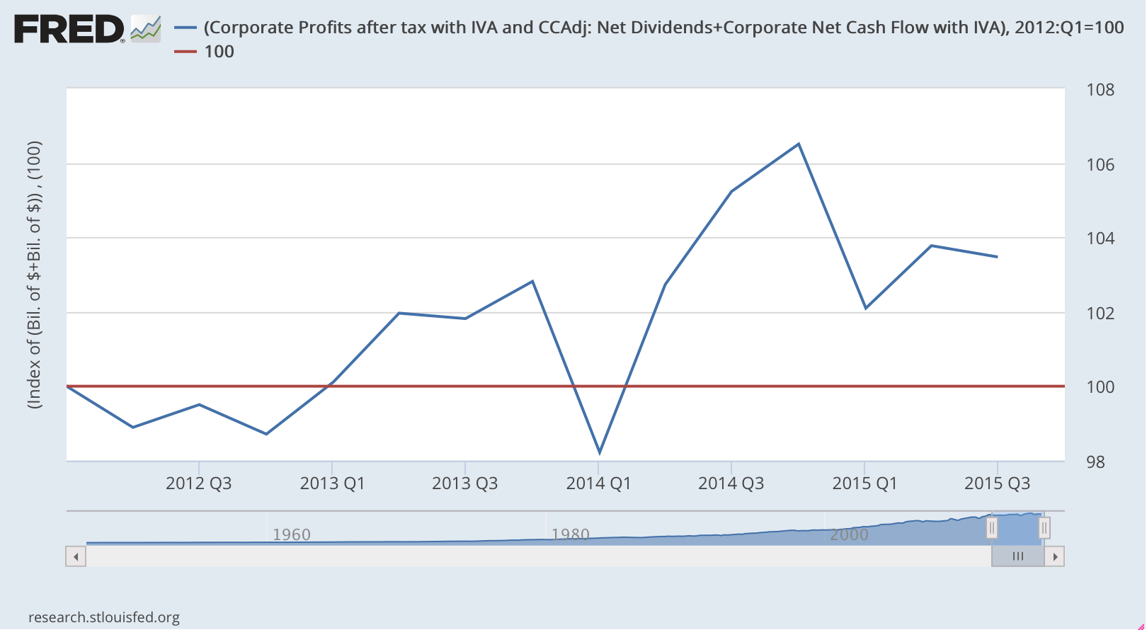
The above chart depicts corporate free cash flows (blue line) indexed to 100 in Jan 2012. It is obtained by taking the BEA’s Net Cash Flow with IVA and CCAdj adding back depreciation and net dividends and subtracting net capex. (The actual definitions of these can be found here .)
What we find is that while the current valuation of expected future free cash flows to equity holders (i.e. market cap of Wilshire) has increased by some 55% since the end of 2011, the actual free cash flows of US corporations have only increased by 4%.
This becomes a very difficult fact to reconcile inside the classroom. Why would market participants be baking in so much growth when the actual data simply doesn’t support it?
Well there are plenty of potential explanations. For instance, rarely are investors rational. While buy low and sell high is rational investing behaviour, often market euphoria comes at the market top right before a major sell off, leading to a buy high and sell low strategy. Another reason is that the Fed has been providing a free put to all investors for the past 7 years essentially significantly reducing naturally occurring risk factors. But whatever the reason this dislocation between expected and realized growth begs the question, how long can it last? So let’s explore this issue.
Below is a longer term growth chart of the Wilshire vs US corporate free cash flows to equity holders both indexed to 1995 (i.e. 1995 = 100).
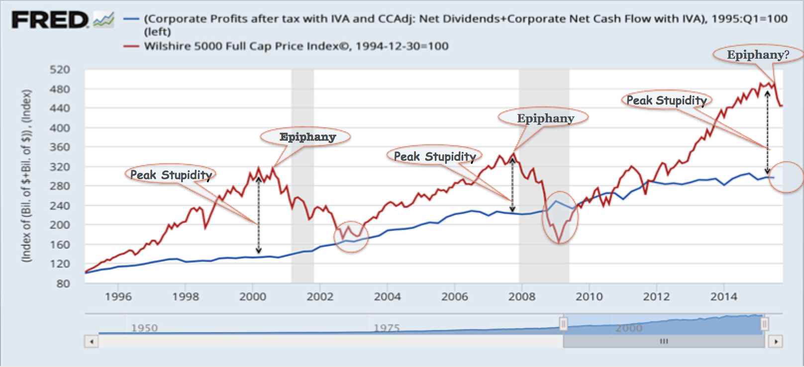
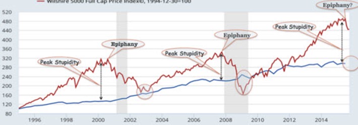
And so over the past 20 years we’ve seen this same type of dislocation three times. That is, we see expectations of growth far exceeding actual growth of free cash flows to equity holders. In the previous two dislocations we reached a peak dislocation (peak stupidity) followed by a reversion to reality (epiphany) where expected growth moves back in line with actual growth. Let’s have a closer look at specific indicators as to when the epiphany takes place.
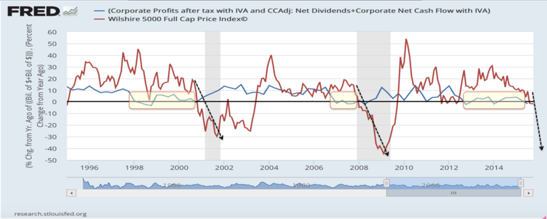
What we find is that the epiphany trigger occurs when YoY growth of free cash flows to equity holders drops down to or below zero. The last two bubbles began their burst when medium term moving average of free cash flows dropped to zero. We see the very same pattern occurring presently. Today we appear to have just passed the peak stupidity inflection point as seen in the two charts above.
But let’s be sure not to ignore the technical patterns, so let’s do some charting. If we look to volatility and price level patterns between our current market and the last bubble cycle (credit crisis) we find incredible similarities.
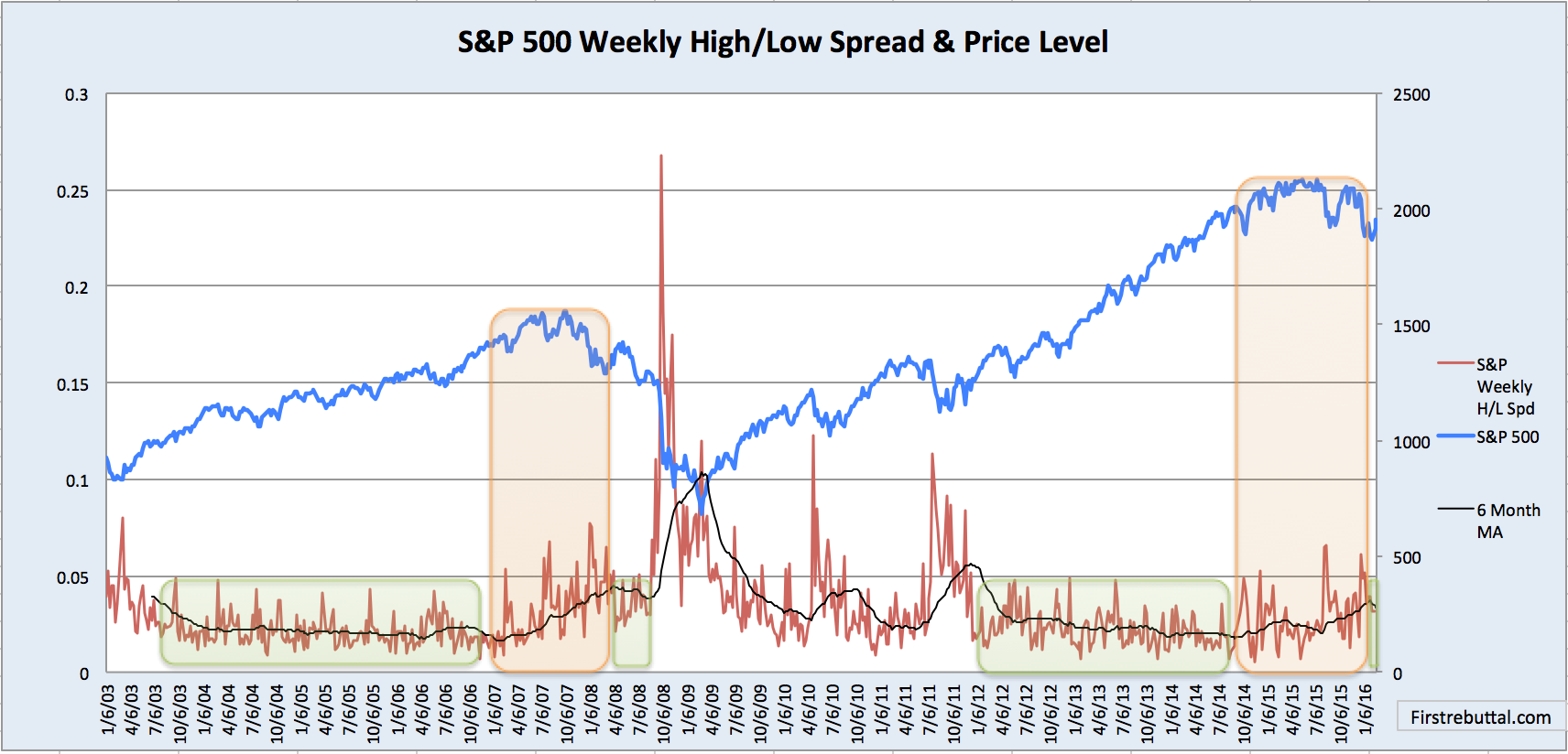
The above chart depicts weekly high vs low intra-week price spreads and price level. What we find is that at this point in the last bubble cycle we had a period of reduced volatility (small green box in 08) that followed a period of increased volatility as the market slowly rolled over. Today’s bubble is just entering that period of reduced volatility following the period of increased volatility as the market rolled over.
And so what should we expect from here?
Well the fundamental charts above suggest we have significantly overvalued growth expectations and historically those over-inflated expectations can drop very sharply back in line with actual growth. So from a fundamentals perspective we should expect a significant drop in overall valuations (i.e. market cap).
And from a technical perspective, if we are in fact following the previous bubble cycle pattern (which we seem to be), we should expect a nice bounce in price level from the recent lows (to perhaps somewhere between 2000 – 2030) accompanied by relative calm before an explosion of volatility and a market price plunge that sends us into the next crisis sometime around May (give or take). Happy trading!
